Mix & Match

Maximize your wardrobe with clever combinations

Beyond Prints: Texture Mixing for Outfits With Depth

2026-07-15

Quick Answer: Texture mixing means combining fabrics with opposing tactile qualities — soft against structured, matte against sheen, smooth against grained. Use two textures minimum for depth and three as the ceiling, weighted as one dominant, one contrast, one accent. It’s what makes monochrome outfits look expensive instead of flat.

Print mixing gets all the tutorials. Texture mixing does the quiet professional work.

It’s the reason a head-to-toe cream outfit can look either luxurious or like pajamas, and the difference has nothing to do with color. Knit meets leather meets silk, and a single-color look turns dimensional.

Here’s the tactile styling masterclass, no patterns required.
Beyond Prints: Texture Mixing for Outfits With Depth

At a glance

What Is the Texture Contrast Principle?

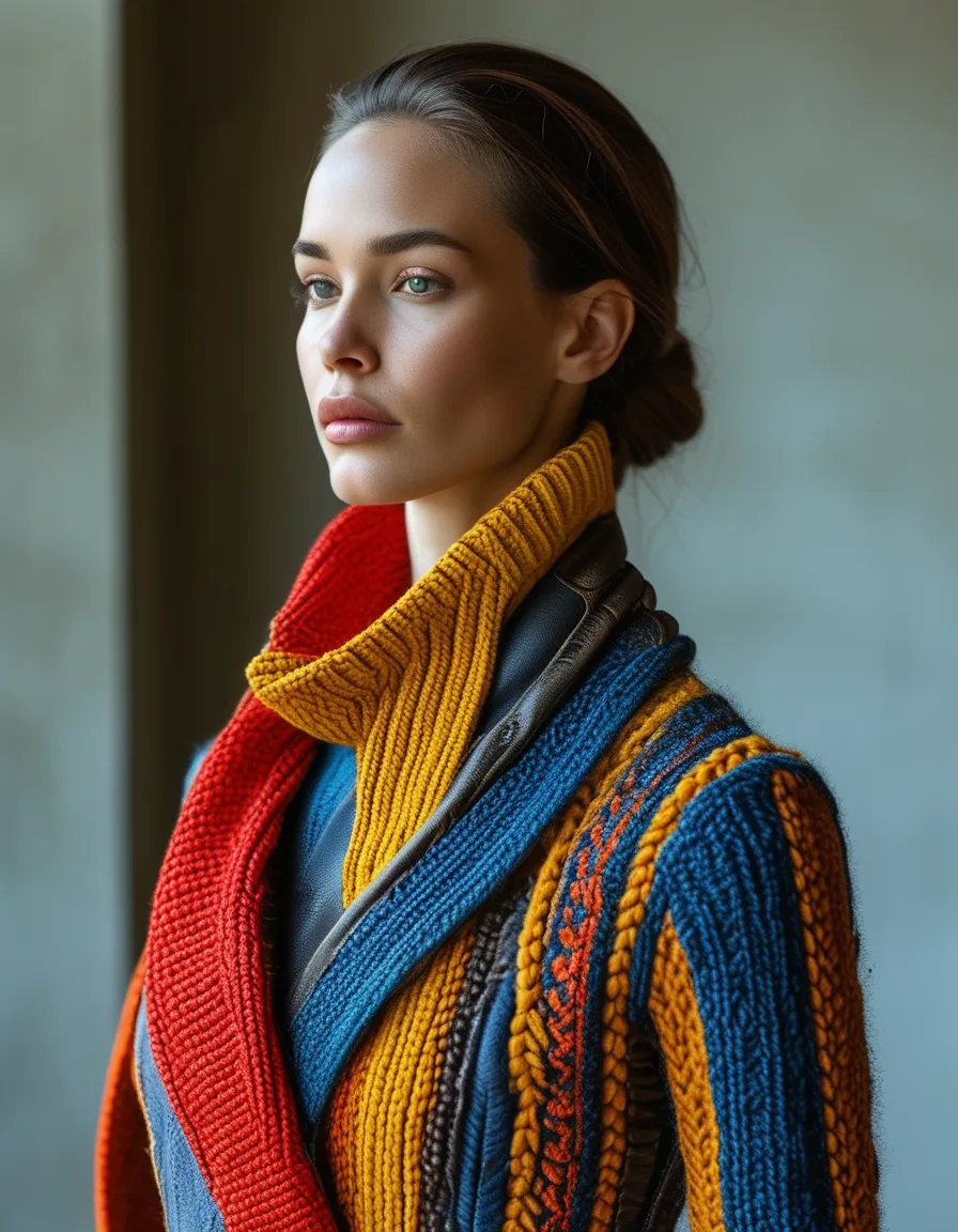
Texture mixing runs on tactile opposition. Three reliable pairings:

  • Soft against structured — a chunky knit with a leather trouser
  • Matte against sheen — crepe with satin, wool with silk
  • Smooth against grained — silk with suede, poplin with bouclé

Two textures is the minimum for depth. The contrast is the interest a print would otherwise have supplied, which is why texture-mixed outfits can be entirely plain and still hold your eye.

The mechanism is light. Matte fabrics absorb it, sheen fabrics bounce it, and grained fabrics scatter it — put them together and the outfit has highlights and shadows instead of one flat plane.

How Many Textures Is Too Many?

Three is the ceiling. Knit plus leather plus a silk scarf reads rich. Five textures reads like a fabric store incident.

And weight them: one dominant, one contrast, one accent. A chunky knit as the dominant, a leather trouser as the contrast, a silk scarf as the accent. Equal thirds of three textures competes with itself.

The print-mixing guardrails translate directly here — texture is just pattern you feel instead of pattern you see. Same rules about scale, dominance and restraint apply.

Beyond Prints: Texture Mixing for Outfits With Depth

The Monochrome Masterclass

This is texture’s flagship application: the one-color outfit built in three textures.

Cream ribbed knit, cream wide-leg trouser in a matte crepe, cream silk scarf. A tonal column with dimensional interest — the technique behind essentially every “expensive-looking” monochrome look on every inspiration feed.

Color does the unity. Texture does the story.

A practical note: exact color matching is not required and often looks worse. Shades within one or two steps of each other — ivory, cream, oat — read as deliberate tonal dressing, while a perfect match can look like a uniform. Different fabrics take dye differently anyway, so cream cashmere and cream silk will never truly match.

How it works

How Does Texture Change by Season?

Summer: crochet, linen, cotton poplin, raffia. The conversation is between open and closed weaves — an airy crochet top against a crisp poplin trouser, straw against smooth cotton.

Autumn: suede, chunky knit, denim, corduroy. The classic combinations, and the season where texture does the most work because the palette narrows to browns, creams and greys.

Winter: wool, shearling, leather, heavy knit — plus one smooth element (a silk shirt collar, a leather boot) to stop everything reading as bulk.

Year-round: the leather-and-soft axis. A leather jacket over anything fluid is a texture mix that has never once stopped working.

What Nobody Tells You About Texture

“Flat” is almost always a texture problem, not a color problem. If an outfit looks fine on paper and boring in the mirror, the fix usually hangs in your closet in the same shade but a different fabric. Swap the cotton tee for a ribbed knit and watch the whole thing wake up.

Texture reads at conversational distance; print reads across a room. That’s why texture mixing looks quietly expensive rather than attention-seeking — it rewards proximity.

Photographs flatten texture badly. An outfit that looks rich in person can look plain in a photo, which is partly why print gets more attention online. Trust the mirror over the camera.

Ribbing counts as texture. You don’t need leather and silk to do this. A ribbed knit against a smooth trouser is a two-texture outfit, and it costs nothing.

Shoes and bags are the cheapest texture accent. A suede boot or a woven bag adds a third texture without touching the outfit itself.

Mini FAQ

Can I mix texture and print in the same outfit?

Yes, but count the print as one of your three slots and keep the textures subtle. A printed silk blouse with a plain chunky knit and smooth trousers works; a printed blouse with bouclé, suede and leather is doing too much.

Which textures should never go together?

Very few genuinely clash, but two heavy, high-volume textures fight — chunky bouclé with thick shearling adds bulk in every direction. And two competing sheens (satin with patent leather with sequins) reads costume rather than rich.

How do I start if my wardrobe is all cotton?

Add one contrast piece rather than rebuilding. A knit in a rib or cable, a suede or leather accessory, or a silky scarf will introduce a second texture into everything you already own — one purchase, dozens of outfits.

TL;DR:

  • Mix by opposition: soft/structured, matte/sheen, smooth/grained.
  • Two textures minimum for depth, three maximum — one dominant, one contrast, one accent.
  • Monochrome plus three textures is the “expensive-looking” formula.
  • Shades one or two steps apart look better than an exact color match.
  • If an outfit reads flat, the missing element is texture, not color.

Oppose the tactile, cap at three, master the monochrome edition. Texture was always the depth dial — the print tutorials just talked louder than the fabrics.

Keep Reading

This article is for general styling and informational purposes only. Trends, sizing, availability and pricing may vary by brand and season.

texture mixingoutfit depthfabric contrast

← All articles