Mix & Match

Maximize your wardrobe with clever combinations

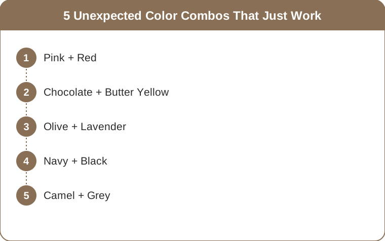
5 Unexpected Color Combos That Just Work

2026-07-14

Quick Answer: Five pairings that look advanced and work automatically: pink + red, chocolate + butter yellow, olive + lavender, navy + black, and camel + grey. Each works because the two colors share an underlying quality — warmth, muted saturation, or depth — even though they look like a clash on paper. Keep one color dominant and the other as accent, roughly 70/30, and any of them reads as deliberate.

Safe color matching keeps you invisible. Nobody has ever crossed a room to ask about a navy top with black trousers — except, oddly, they now do.

The pairings people actually notice are the ones that look slightly wrong for about half a second before they resolve into obviously right.

5 Unexpected Color Combos That Just Work

At a glance

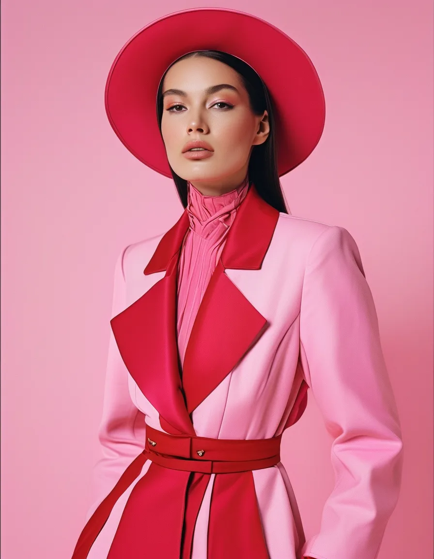
1. Pink + Red

The former forbidden pairing, now fashion’s most reliable power couple.

It works because both are warm and sit close on the color wheel, so there’s tonal harmony underneath the visual tension. The eye reads the relationship as intentional almost immediately.

How to wear it: keep one dominant — a red dress with a pink bag, or a pink knit with red trousers. Or split it evenly for maximum statement, which photographs like pure confidence.

Which pinks: hot pink and fuchsia with bright red work best. Dusty rose with brick red is a softer, more autumnal version of the same idea and considerably easier to wear to work.

Activewear is the low-risk place to test any of these — a bright top over high waist leggings in the paired color costs less to experiment with than a tailored version and tells you within one wear whether the combination suits you.

2. Chocolate + Butter Yellow

Rich brown grounding sunny softness. Dessert in outfit form, and one of the year’s chicest daytime combinations.

It works because both are warm-toned and sit at opposite ends of the same value scale — deep and light — which gives you strong contrast without any color clash at all.

How to wear it: chocolate trousers with a butter-yellow knit is the definitive version. Reverse it (a chocolate knit over a butter skirt) and it becomes more unusual and slightly harder.

Adjacent versions: espresso with cream, tan with pale lemon, chocolate with camel. All variations on the same warm-deep/warm-light structure.

5 Unexpected Color Combos That Just Work

3. Olive + Lavender

Earthy green plus powder purple sounds chaotic and lands sophisticated. This is the one that earns “interesting outfit” comments all day.

It works for a technical reason: green and purple sit near-opposite on the color wheel, so they’re roughly complementary — but because both are muted rather than saturated, the contrast arrives softened. You get the energy of a complementary pairing without the intensity.

How to wear it: an olive utility jacket over a lavender knit, or lavender trousers with an olive top. Add cream or bone as a third neutral if it feels like a lot.

The rule that matters here: keep both muted. Bright green with bright purple is an entirely different and much louder proposition.

4. Navy + Black

Once labeled a mistake, now a deliberate deep-tone luxury move.

It works when you make it obviously intentional. The old prohibition existed because navy and black look accidentally mismatched under bad lighting — as though you got dressed in the dark and picked the wrong trousers.

How to make it read deliberate: vary the textures decisively. Navy silk with black wool tailoring. A black leather jacket over navy denim. Matte against sheen, smooth against rough. The textural contrast tells the viewer this was a choice.

What kills it: two similar matte fabrics in the two colors. That’s when it reverts to looking like an error.

Rich, moody, and quietly rule-breaking — and considerably more interesting than all-black.

How it works

5. Camel + Grey

The quiet-luxury handshake: a warm neutral meeting a cool one, both elevated by the encounter.

It works because neither color is competing for attention, so what you notice is the quality of what you’re wearing. This is why it reads as expensive — it removes every distraction from fabric and fit.

How to wear it: split any outfit between them — camel coat over grey knit, grey trousers with a camel jacket — and add gold hardware or jewelry to warm the whole thing.

Which greys: mid-to-light greys work best with camel. Charcoal with camel is sharper and more formal; both are correct.

It’s the combination wealth wears on weekends, and it costs no more than any other two colors.

Myth vs Fact: Color Rules

Myth: Navy and black don’t go together. Fact: They do, when the textures differ enough to signal intent. The rule was about accidents, not aesthetics.

Myth: Pink and red clash. Fact: They share a warm base and sit close on the wheel — they’re one of the most harmonious pairings available.

Myth: You need a neutral to break up two colors. Fact: Helpful, not required. Two colors sharing an underlying quality don’t need a referee.

Myth: Unexpected combinations only work on people with great style. Fact: They work on anyone who keeps the proportions clear. The 70/30 ratio does most of the work that “great style” gets credit for.

Myth: These pairings are trend-dependent. Fact: All five are rooted in color relationships, not trend cycles. Camel and grey looked good in 1975 and will look good in 2045.

Frequently Asked Questions

How do I know if a color combination is working?

Take a photo. Something about seeing an outfit flattened into two dimensions makes color relationships far more obvious than a mirror does — a combination that felt uncertain in the mirror usually resolves clearly one way or the other in a photo.

What’s the safest of these five to start with?

Camel and grey, comfortably. Both are neutrals, most people already own pieces in each, and the pairing is quiet enough that nobody will look twice while still reading as more considered than either color alone. Chocolate and butter yellow is the next easiest.

Can I use these combinations for accessories only?

Yes, and it’s an excellent way in. A lavender bag with an olive coat, or a pink scarf with a red one — you get the visual interest of the pairing with a fraction of the commitment, and accessories are far cheaper to experiment with than garments.


TL;DR:

  • Pink + red — shared warmth under the tension. Keep one dominant or split evenly
  • Chocolate + butter yellow — warm-deep against warm-light. Trousers and knit is the classic
  • Olive + lavender — near-complementary, softened by both being muted. Keep them muted
  • Navy + black — vary the textures hard so it reads deliberate, not accidental
  • Camel + grey — warm neutral meets cool neutral. Add gold
  • The universal rule: 70/30 proportions, one dominant and one accent
  • Photograph an outfit if you’re unsure — flat images reveal color relationships mirrors hide

Advanced color is mostly borrowed confidence. Pick one pairing, keep the proportions clear, and wear it like you invented it.

Keep Reading

This article is for general styling and informational purposes only. Trends, sizing, availability and pricing may vary by brand and season.

color combinationsstylingfashion

← All articles